
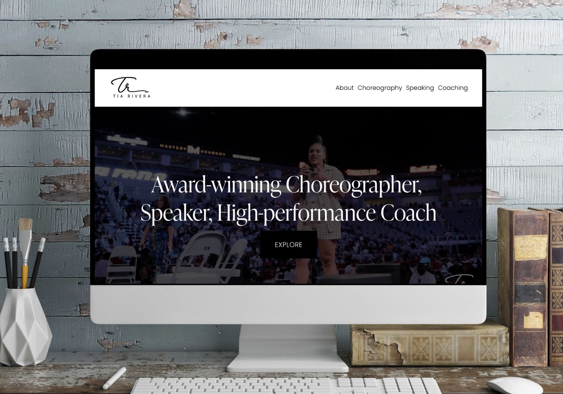

A Squarespace Website Built Around the Work
Some people’s talent speaks for itself. The problem is getting it in front of the right person before they click away.
Tia Rivera is an award-winning choreographer, speaker, and high-performance coach. She moves between three worlds — the stage, the arena, and the coaching room — and each one brings a different kind of client asking a different kind of question. What she needed was one home online that could hold all three without feeling scattered, and that made it obvious how to hire her.
We designed and published that site on Squarespace. Here’s how it came together.
Live site: www.tiarivera.com
The Challenge: Three Careers, One Website
A multi-hyphenate brand is one of the harder briefs in web design. Say too little and visitors can’t tell what you actually do. Say too much and the site turns into a wall of text nobody finishes.
Tia’s audiences don’t overlap much. An event producer looking for a choreographer isn’t the same person as a conference organizer booking a keynote, and neither of them is the individual client considering coaching. Each needed to land on the site, recognize themselves within a few seconds, and find a clear path to the next step.
So the structure came first, before a single design decision: About, Choreography, Speaking, Coaching — four clean doors, each leading to its own story and its own way to connect.
Starting With the Brand, Not the Template
We took Tia’s refreshed brand identity and leaned into contrast: a black-and-white foundation, a refined serif for headlines, and generous white space that lets photography and video do the heavy lifting. Her signature-style logo mark carries through the header and reappears as a subtle watermark across the site.
The result is a look that reads as premium without shouting. When your work is visual and physical — choreography, stage presence, performance — the design’s job is to get out of the way and frame it properly. A quiet, confident brand palette does that. A busy one competes with it.
Custom Galleries That Don’t Look Like a Template
Squarespace is a strong platform, and it comes with a real trade-off: thousands of sites run the same handful of templates, so it’s easy to build something that looks like everyone else.
We pushed past the defaults with custom gallery layouts built specifically for Tia’s work — asymmetric arrangements, intentional cropping, and motion where motion earns its place. Her choreography reels and performance footage are given room to play instead of being squeezed into a uniform grid.
That’s the edge: the platform gives you reliability, hosting, and an editor Tia can use herself, while the custom work gives the site a signature. You don’t have to choose between “easy to maintain” and “doesn’t look like a template.”
Built to Book, Not Just to Browse
A portfolio site that only shows work is a brochure. A portfolio site that converts is a business asset.
Every service section on Tia’s site ends somewhere useful. Choreography, speaking, and coaching each have their own connect page, so an inquiry arrives already sorted by what the person actually wants — no generic contact form, no guessing at intent, no back-and-forth just to find out why someone reached out.
We placed calls to action at the natural decision points: after the hero, after the proof, at the end of each service story. Not aggressive, just present. Visitors always have an obvious next step in front of them, whichever page they’re on and however far they scroll.
Clean, Modern, and Fast to Run
The finished site is deliberately restrained. Bold headline typography, strong imagery, short copy, and clear paths — nothing decorative that doesn’t carry weight.
It’s also built to be lived in. Tia can add a new performance, update a speaking date, or swap gallery content without calling anyone. The structure holds up as her work grows, which is the real test of a website: not how it looks on launch day, but whether it still works a year later.
The Same Process Works for Your Business
Tia’s site is a personal brand site, but nothing about this approach is specific to choreography. We follow the same sequence for a contractor, a consultant, a clinic, or a shop:
- Get clear on the brand — how it looks, how it sounds, who it’s for.
- Design the structure around the buyer, not around your org chart.
- Build it on a platform you can actually run — Squarespace, WordPress, whatever fits how you work.
- Put a next step everywhere a visitor might be ready for one.
- Launch it, then keep it current — a site that’s never touched after launch quietly stops earning.
If your current website is a few years past its prime, doesn’t look like the quality of work you deliver, or simply isn’t bringing in inquiries — that’s a fixable problem, and usually a faster one than business owners expect.
Ready for a website that works as hard as you do? Book a call and let’s talk about what your site needs to do for your business.