

There’s a specific kind of stuck that a lot of organizations know well. The website works — technically. But every change means emailing someone who knows how to edit the code, waiting, and hoping it comes back right. So most changes never get requested at all, and the site slowly falls out of step with the work it’s supposed to represent.
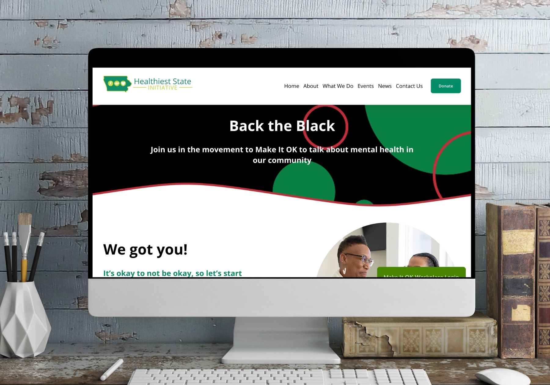
That was the Iowa Healthiest State Initiative’s site when we took it on: an older, boxed-in HTML build that looked its age and that nobody on staff could update themselves. We redesigned and rebuilt it on Squarespace, and then went further — leading the creative direction, production, and event planning for one of the organization’s campaigns.
See it live: Back the Black on iowahealthieststate.com
The Challenge: A Website the Team Couldn’t Touch
Iowa Healthiest State runs real programming — statewide initiatives, partner networks, and public health campaigns that change and grow. A site that requires a developer for every edit can’t keep up with that. New resources sit in a folder instead of on a page. Campaign pages go up late. The team ends up working around their own website.
The other problem was visual. The old build had the fixed-width, boxed layout of an earlier era of the web. On a phone it felt cramped; on a large monitor it floated in the middle of the screen. Neither impression matched the credibility of the organization behind it.
So the brief had two halves: make it look current, and make it theirs to run.
Same Brand, Fresh Expression
This was a redesign, not a rebrand. Iowa Healthiest State had established brand colors and an identity that partners already recognized — throwing that out would have cost them recognition they’d spent years building.
Instead, we gave the existing brand room to breathe. The same colors, applied with more restraint and more white space. Cleaner type. Full-width imagery instead of boxed containers. Clear section rhythm so a long page reads as a sequence of ideas rather than an undifferentiated block of text.
Why “Refresh” Usually Beats “Rebrand”
Business owners often assume a dated-looking website means the brand needs replacing. Usually it doesn’t. Most brands that feel tired are being applied badly — cramped layouts, too many competing colors, type that fights itself — not designed badly. Fixing the application is faster, cheaper, and keeps every bit of recognition you already own. We recommend a true rebrand only when the brand genuinely no longer fits the organization.
Built for the People Who Run It
The whole point of moving to Squarespace was handing the keys back.
We structured the site so the pages staff touch most often are the easiest ones to edit — reusable section patterns, consistent layouts, and no fragile custom code standing between a staff member and a simple content update. Adding a resource, posting news, or spinning up a new campaign page now takes minutes and requires no one outside the organization.
That changes the economics of owning a website. A site the team can maintain stays current. A site only a developer can touch becomes a line item and then, eventually, an embarrassment.
Back the Black: Leading the Campaign, Not Just Building the Page
Our work with Iowa Healthiest State went past the build. We also headed the Back the Black campaign — a mental health awareness effort focused on the Black community, created as a culturally specific companion to the organization’s long-running Make It OK anti-stigma campaign.
That meant creative direction from the start:
- Campaign branding developed specifically for Back the Black, designed to stand on its own while clearly belonging to the Make It OK family — a sub-brand, not a separate one.
- Photography and videography — sourcing and directing the photographer and videographer so the campaign had authentic imagery of the community it speaks to, rather than stock.
- Event planning — helping plan and promote a community event built around starting the conversation in person, not only online.
- The campaign page itself, which carries the message and routes people to the next step.
Campaign work like this is where brand discipline earns its keep. Back the Black needed its own voice to reach the people it’s for, and it needed to read as part of something larger and established. Getting both at once is a design problem before it’s a marketing problem.
Every Page Ends Somewhere
A nonprofit site has to do more than inform — it has to convert interest into participation.
The campaign page gives visitors distinct, concrete next steps depending on who they are: get resources, make the commitment, become a representative, or register your organization. Someone looking for help and someone looking to bring the campaign to their workplace need different doors, and both are visible without hunting.
That’s the same principle behind a “request a quote” button on a contractor’s site. Know who’s reading, and give each person the one action that makes sense for them.
What This Looks Like for Your Business
You don’t need to be a statewide nonprofit for any of this to apply:
- If your site is stuck, fix the ownership problem first. A beautiful site you can’t update is a slow-motion version of the same trouble.
- Refresh before you rebrand. Keep the equity you’ve built; change how it’s applied.
- Build on a platform your team can actually run — and set it up so the common tasks are the easy ones.
- Give every page a next step, matched to who’s reading it.
- Keep it current after launch. That’s the whole return on the investment.
If your website is a few years past its prime, or you’ve been waiting on someone else to make a change you could make yourself — that’s a solvable problem, usually faster than you’d expect.
Ready for a website your team can actually run? Book a call and let’s talk about what yours needs to do.